Crest & Identity Design
"After meeting Kane it soon became apparent that he bought into our ideas. His skills and enthusiasm have been put to great use, re-designing our programmes, enhancing our social media offering and generally up-selling the Club. Kane has been a breath of fresh air and we’re all looking forward to developing our partnership further."
— Gary, Frome Town FC
Having lived in Frome for 23 years and being an avid football fan, when Frome Town FC were looking for a Graphic Design assistance - I jumped at the chance to work side-by-side with my local team. Starting in Summer 2018, we’ve created and continue to build a fresh and advanced identity in comparison to teams surrounding the club.
Kick-Off
Frome Town FC were looking for a new identity that will allow them to engage with younger audiences, whilst still remaining relatable to their older fans too. The choice was made to keep the original club crest, with a new badge being re-visited in the future. Whilst planning, I was also tasked with creating a campaign/slogan that the club can use, to drive engagement with the local community - getting involved with younger audiences, and helping local causes.
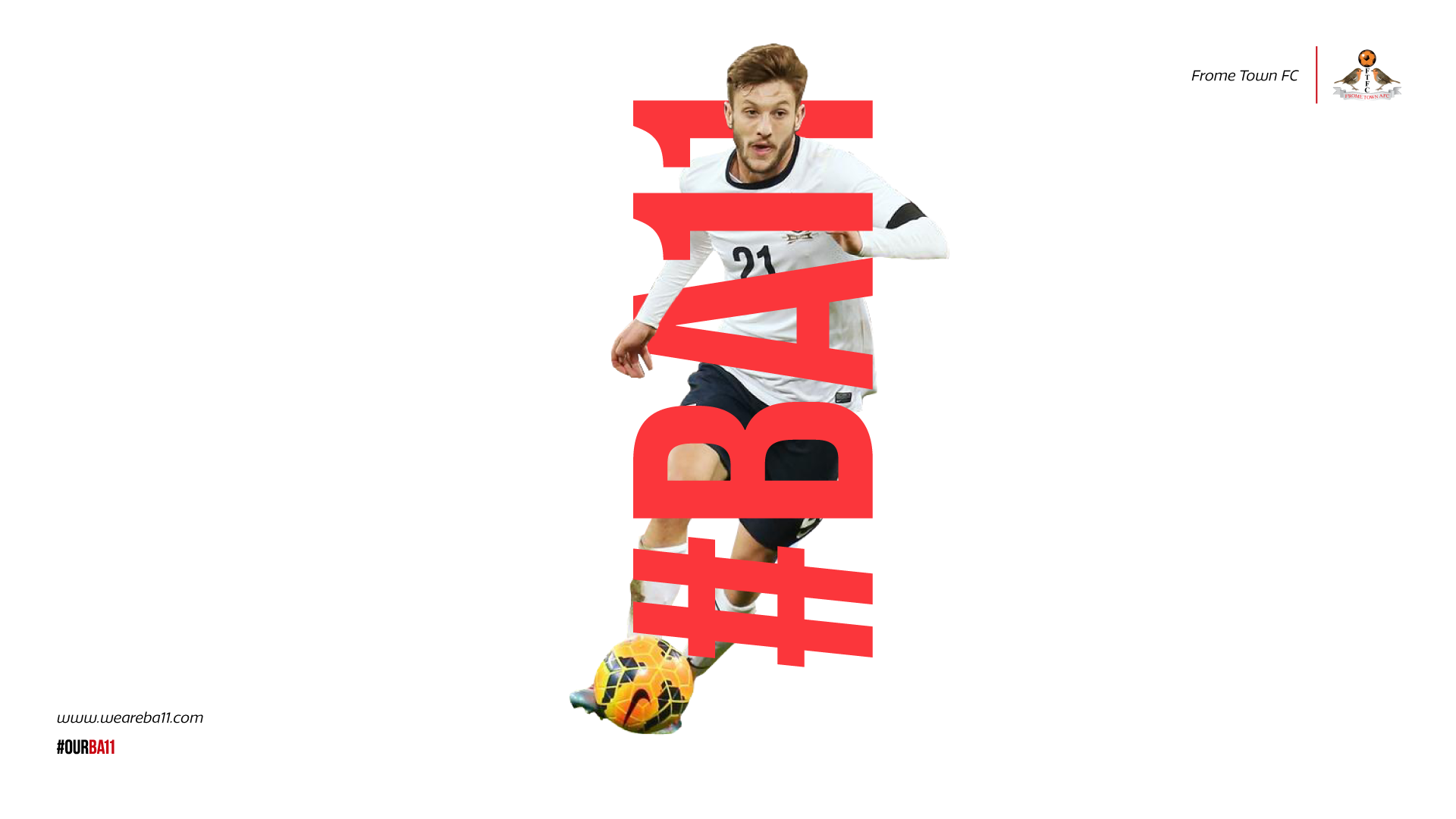
We Are #BA11
I came up with “We Are #BA11” - a word-play with Frome’s postcode (BA11) and ‘ball’. With this, we have potential to use a number of football and community tag lines to generate a feeling of unity and pride throughout the fans, players, and staff: “This is Our #BA11” and more.
Socials & Website
Keeping in-line with the original colour scheme, I’ve created a set of backgrounds and styles that are easily interchangeable across all media. I aimed to produce an identity that has retro yet forward moving connotations, with contemporary layouts and fonts.
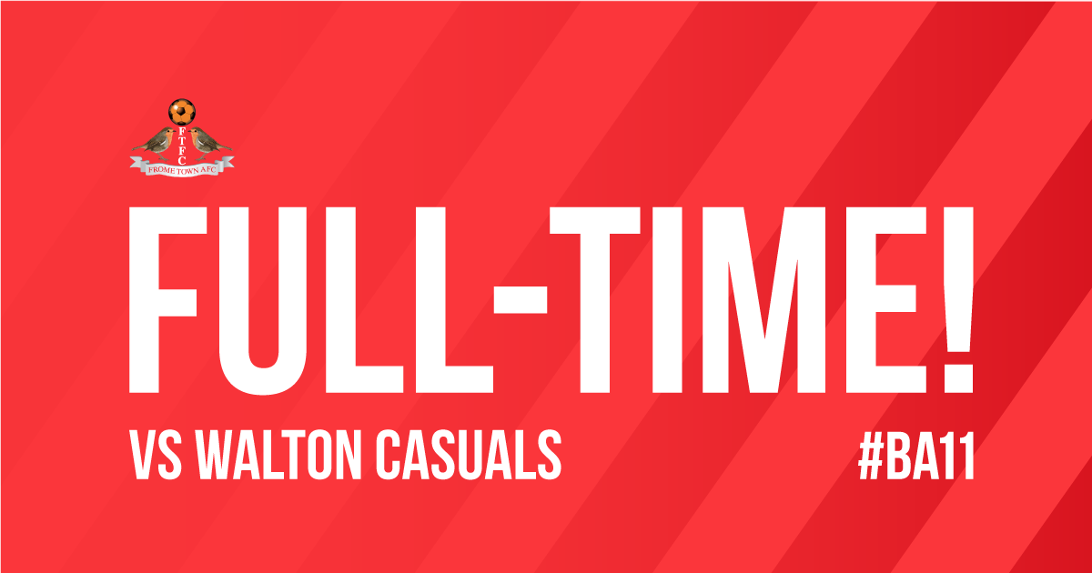
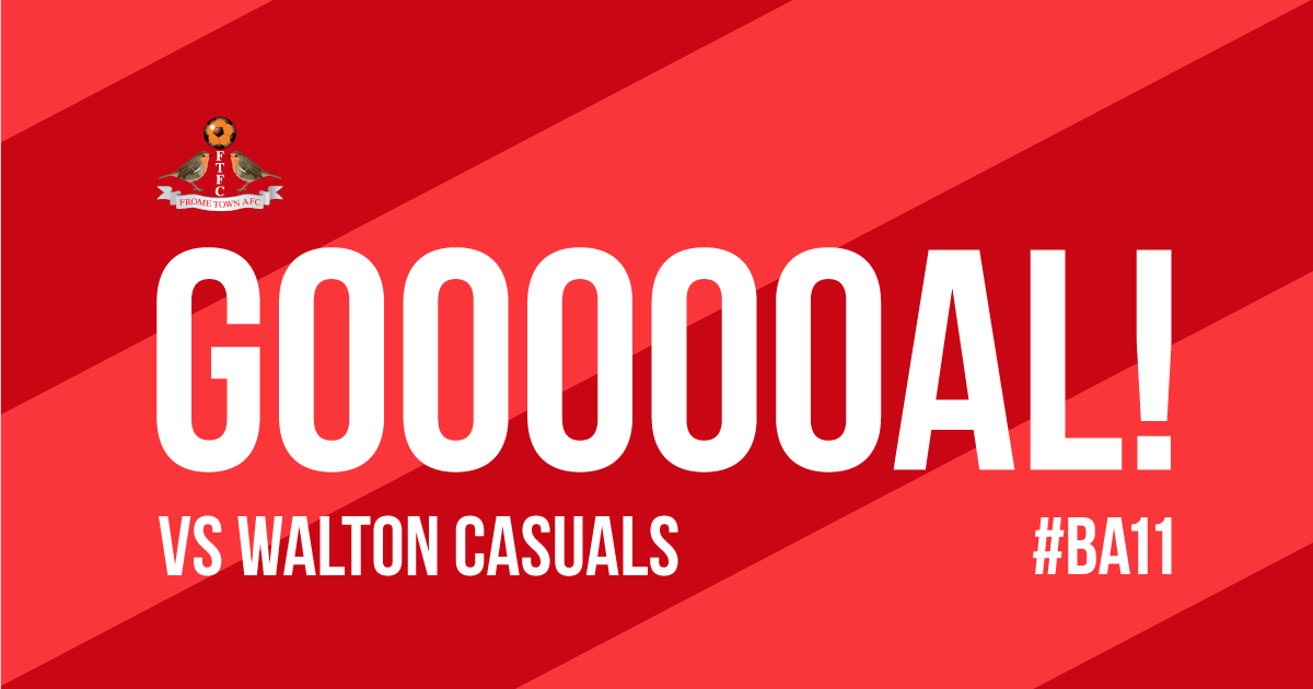
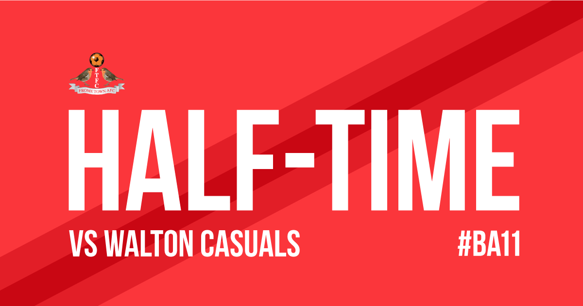
Social assets such as match day images have been created to help game updates be more easily identifiable, and the website (created by SF Consult) follows the same rules too.
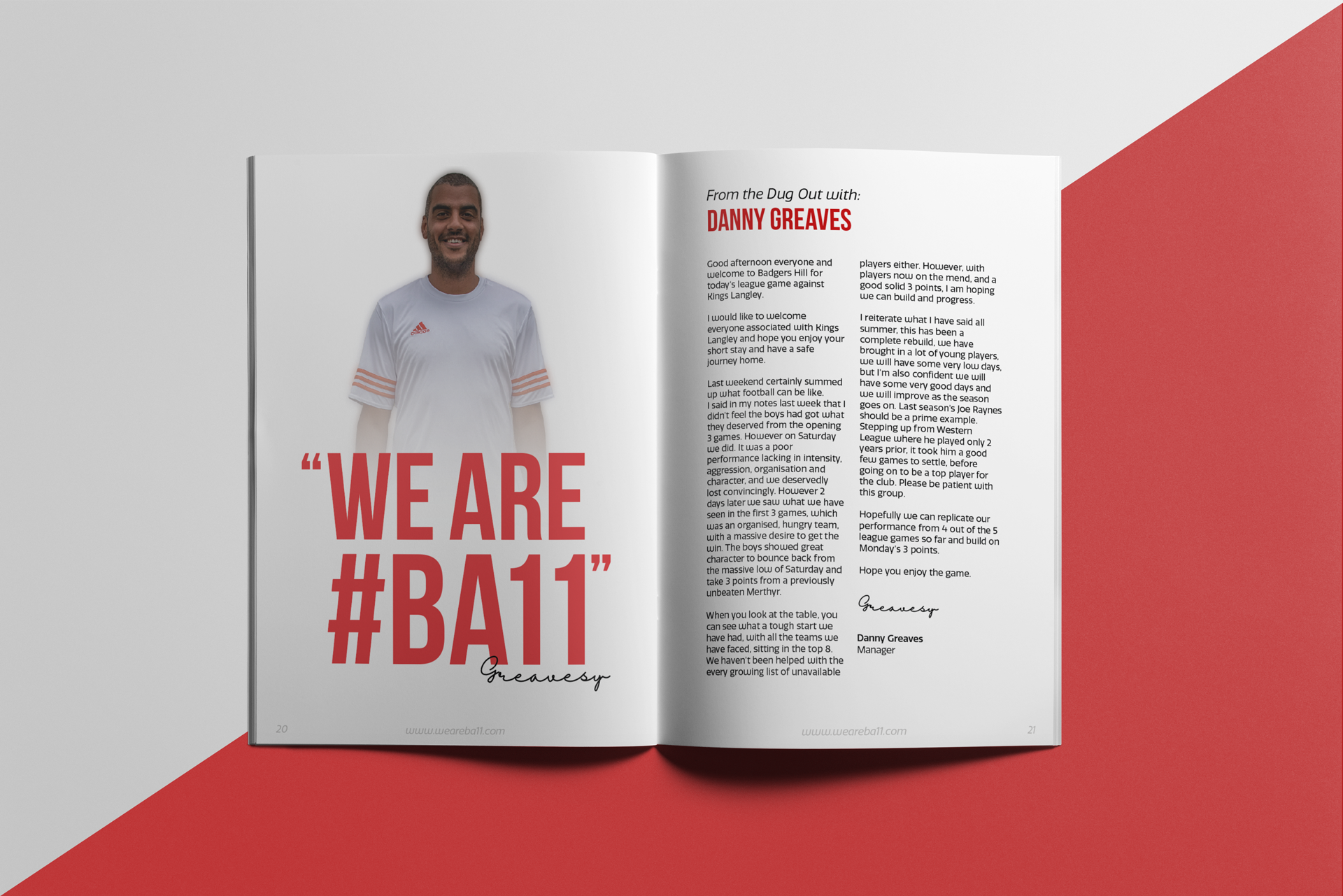
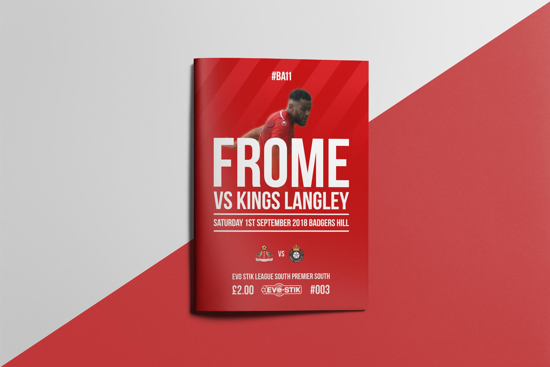
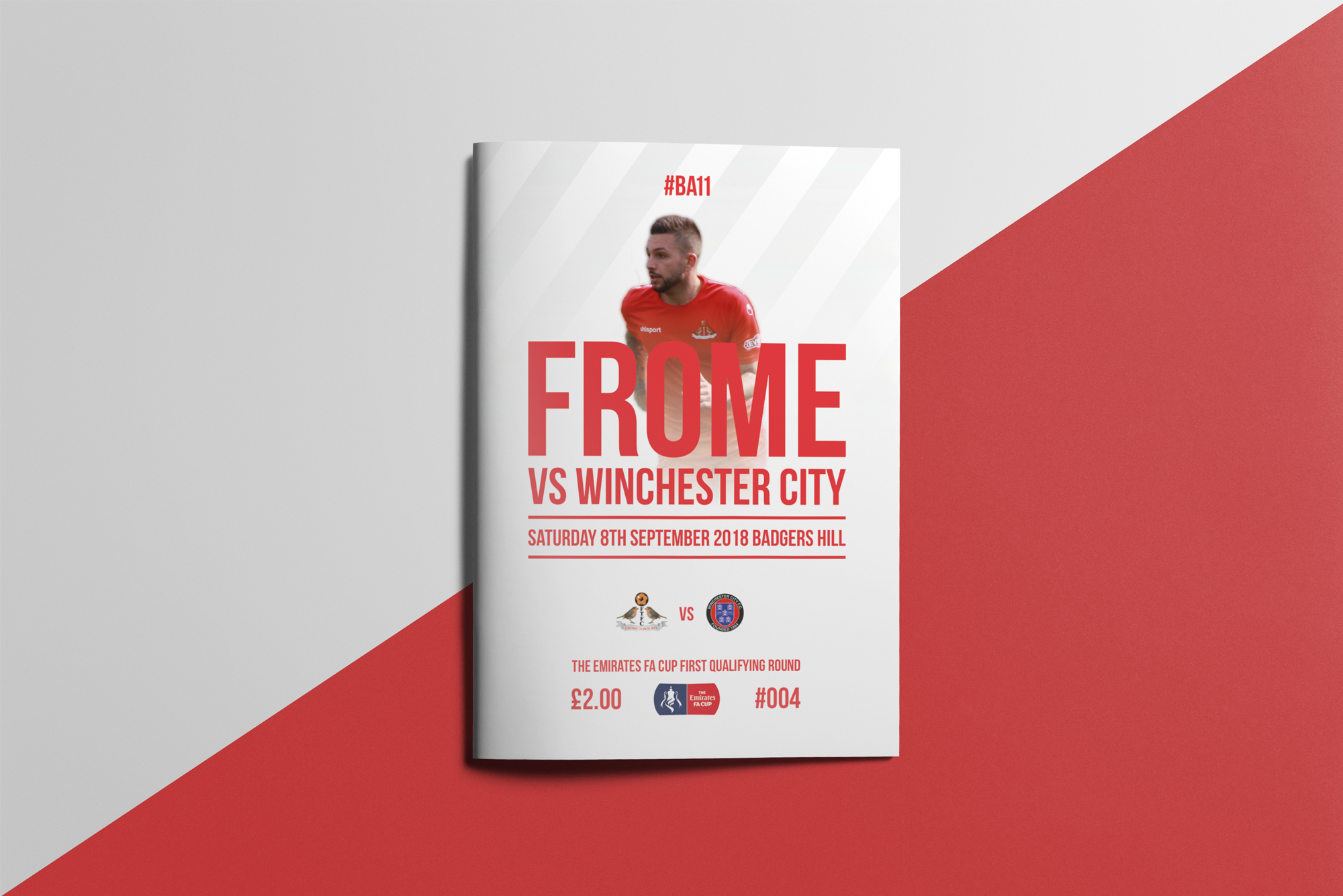
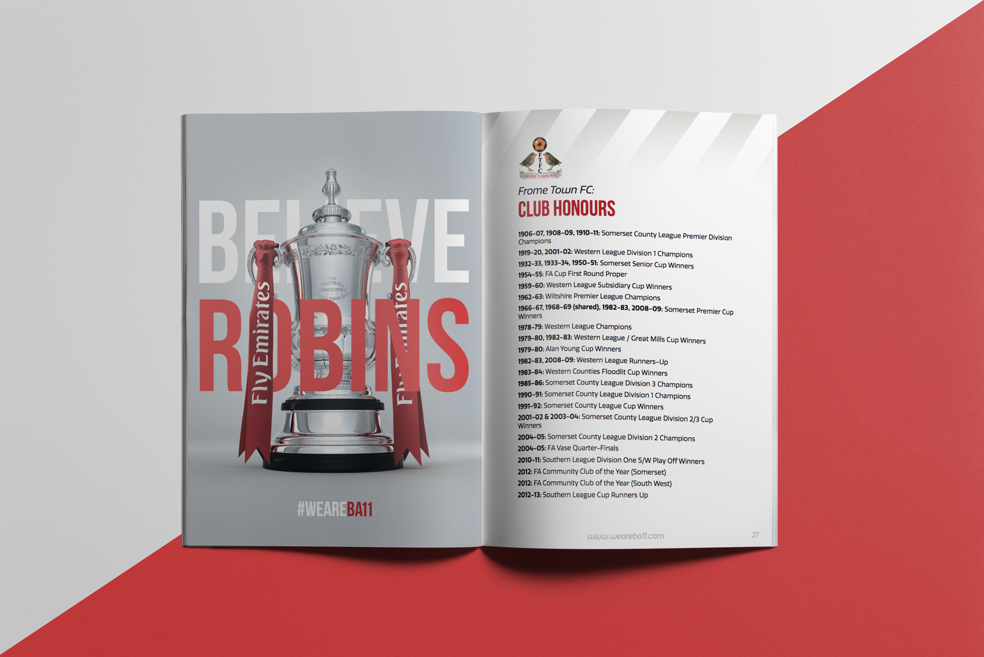
Match Day Programme
A key point of contact with all fans, the match day programmes. These are designed and created by myself with an on-going basis. The previous designs were generic, with almost identical looks being used by all teams in the league. This Season (2018/19), we’ve been able to adopt our own image and take our previous 24 page booklet up to 32 pages, with further growth planned. As well as quantity, we’ve also increased the quality of content - introducing more in-depth, and aesthetically pleasing images, text, and interactions. Our aim was to create a closer connection between fans and players/staff, so we now feature challenges, fan pages, staff interviews and the player spotlight - where individual team members are chosen for each issue, featuring on the cover, double page pull out poster, and subject to a personal questionnaire!
